Code
pacman::p_load(scales, viridis, lubridate, ggthemes, gridExtra, readxl, knitr, data.table, CGPfunctions, ggHoriPlot, ggrepel, ggiraph, plotly, ggh4x, patchwork, gganimate, hrbrthemes, tidyverse)Exploration into Singapore’s Trade Partners
This take-home exercise requires uncovering the impact of COVID-19, global economics, and political dynamics on Singapore’s bilateral trade (i.e. Import, Export, and Trade Balance). The exercise should focus on the appropriate analytical visualization techniques learned in Lesson 6: It’s About Time and appropriate interactive techniques are encouraged to enhance users’ data discovery experiences.
Merchandise Trade provided by the Department of Statistics, Singapore (DOS) will be used in this take-home exercise, and the study period should be between January 2020 to December 2022. You can see more detail about the dataset here.
Use paccman:: to install required R packages and load them onto RStudio environment.
pacman::p_load(scales, viridis, lubridate, ggthemes, gridExtra, readxl, knitr, data.table, CGPfunctions, ggHoriPlot, ggrepel, ggiraph, plotly, ggh4x, patchwork, gganimate, hrbrthemes, tidyverse)The raw dataset is imported using read_xlsx and here we need sheets T1 and T2. The range is set to exclude unwanted information and data from 2020, 2021, and 2022 are selected.
impodata <- read_xlsx("data/merc.xlsx",
                       sheet = "T1",
                       range = cell_rows(10:128)) %>%
  select(`Data Series`, contains(c("2020", "2021", "2022")))

expodata <- read_xlsx("data/merc.xlsx",
                       sheet = "T2",
                       range = cell_rows(10:100)) %>%
select(`Data Series`, contains(c("2020", "2021", "2022"))) The original dataset is wide with each date as a column. In data wrangling, the date is arranged in a row by using pivot_longer( ) for further analysis. To unify the unit, mute_at( ) is adopted to convert variables numbered in millions to thousands. In the data frame, ymd( ), month( ), year( ) are to create new fields of date.
impodata_pivot <- impodata %>%
  pivot_longer(
     cols = `2020 Dec`:`2022 Jan`,
     names_to = "Import_Date",
     values_transform = as.numeric,
     values_to = "Import_Value") %>%
  pivot_wider(
    names_from = `Data Series`,
    values_from = Import_Value
  )

expodata_pivot <- expodata %>%
  pivot_longer(
     cols = `2020 Dec`:`2022 Jan`,
     names_to = "Export_Date",
     values_transform = as.numeric,
     values_to = "Export_Value") %>%
  pivot_wider(
    names_from = `Data Series`,
    values_from = Export_Value
  )

impodata_pivot$`Import_Date` <- ym(impodata_pivot$`Import_Date`)
expodata_pivot$`Export_Date` <- ym(expodata_pivot$`Export_Date`)

imp <- impodata_pivot %>%
  mutate_at(vars(contains('Million Dollars')), ~ (. *1000))
exp <- expodata_pivot %>%
  mutate_at(vars(contains('Million Dollars')), ~ (. *1000))

colnames(imp) <- gsub(" (Million Dollars)", "", colnames(imp), fixed = TRUE)
colnames(imp) <- gsub(" (Thousand Dollars)", "", colnames(imp), fixed = TRUE)
colnames(exp) <- gsub(" (Million Dollars)", "", colnames(exp), fixed = TRUE)
colnames(exp) <- gsub(" (Thousand Dollars)", "", colnames(exp), fixed = TRUE)
The inner_join( ) is to combine the data for import and export together to create the trade balance table. Mutate the new column for the balance of trade and the total trade volume.
imp_con <- imp %>%
  pivot_longer(-Import_Date,
               names_to = "Region",
               values_to = "Import_Value(KUSD)")

imp_con$Import_Month <- factor(month(imp_con$Import_Date),
                    levels=1:12,
                    labels=month.abb,
                    ordered=TRUE)
imp_con$Import_Year <- year(ymd(imp_con$Import_Date))

exp_con <- exp %>%
  pivot_longer(-Export_Date,
               names_to = "Region",
               values_to = "Export_Value(KUSD)")

exp_con$Export_Month <- factor(month(exp_con$Export_Date),
                    levels=1:12,
                    labels=month.abb,
                    ordered=TRUE)
exp_con$Export_Year <- year(ymd(exp_con$Export_Date))In this part, the patterns of Singapore’s bilateral trade will be revealed by using static and interactive visualization techniques.
The horizon graph is plotted by geom_horizon to show the general trend and distribution of Singapore’s bilateral trade, where blue shows the trade surplus and red is the trade deficit. From the graph, we can see that red and blue are almost equally distributed which indicates the export volume and import volume are close to each other. Some countries (e.g., Australia, and Yemen) can see a relatively constant trend of trade surplus or deficit to Singapore.
balance_data <- imp_con %>%
  inner_join(exp_con, by = c("Region" = "Region", "Import_Date" = "Export_Date", "Import_Month" = "Export_Month", "Import_Year" = "Export_Year"))

names(balance_data) <- c("Date", "Region", "Import_Value(KUSD)", "Month", "Year", "Export_Value(KUSD)")

balance_data <- balance_data %>%
  mutate(BOT = `Export_Value(KUSD)` - `Import_Value(KUSD)`)  %>%
mutate(Trade_Volume = `Export_Value(KUSD)` + `Import_Value(KUSD)`)balance_data %>%
group_by(Region) %>%
filter(Region !="Asia" & Region != "America" & Region != "Europe" & Region != "Africa" & Region != "Oceania" & Region != "European Union") %>%
ungroup() %>%
na.omit() %>%
ggplot() +
geom_horizon(aes(x = Date, y=BOT),
origin = "midpoint",
horizonscale = 6)+
facet_grid(`Region`~.) +
theme_few() +
scale_fill_hcl(palette = 'RdBu') +
theme(panel.spacing.y=unit(0, "lines"), strip.text.y = element_text(
size = 5, angle = 0, hjust = 0),
legend.position = 'none',
axis.text.y = element_blank(),
axis.text.x = element_text(size=7),
axis.title.y = element_blank(),
axis.title.x = element_blank(),
axis.ticks.y = element_blank(),
panel.border = element_blank()
) +
scale_x_date(expand=c(0,0), date_breaks = "2 month", date_labels = "%b%y") +
ggtitle("Singapore's Balance of Trade by Country (Jan 2020 to Dec 2022)")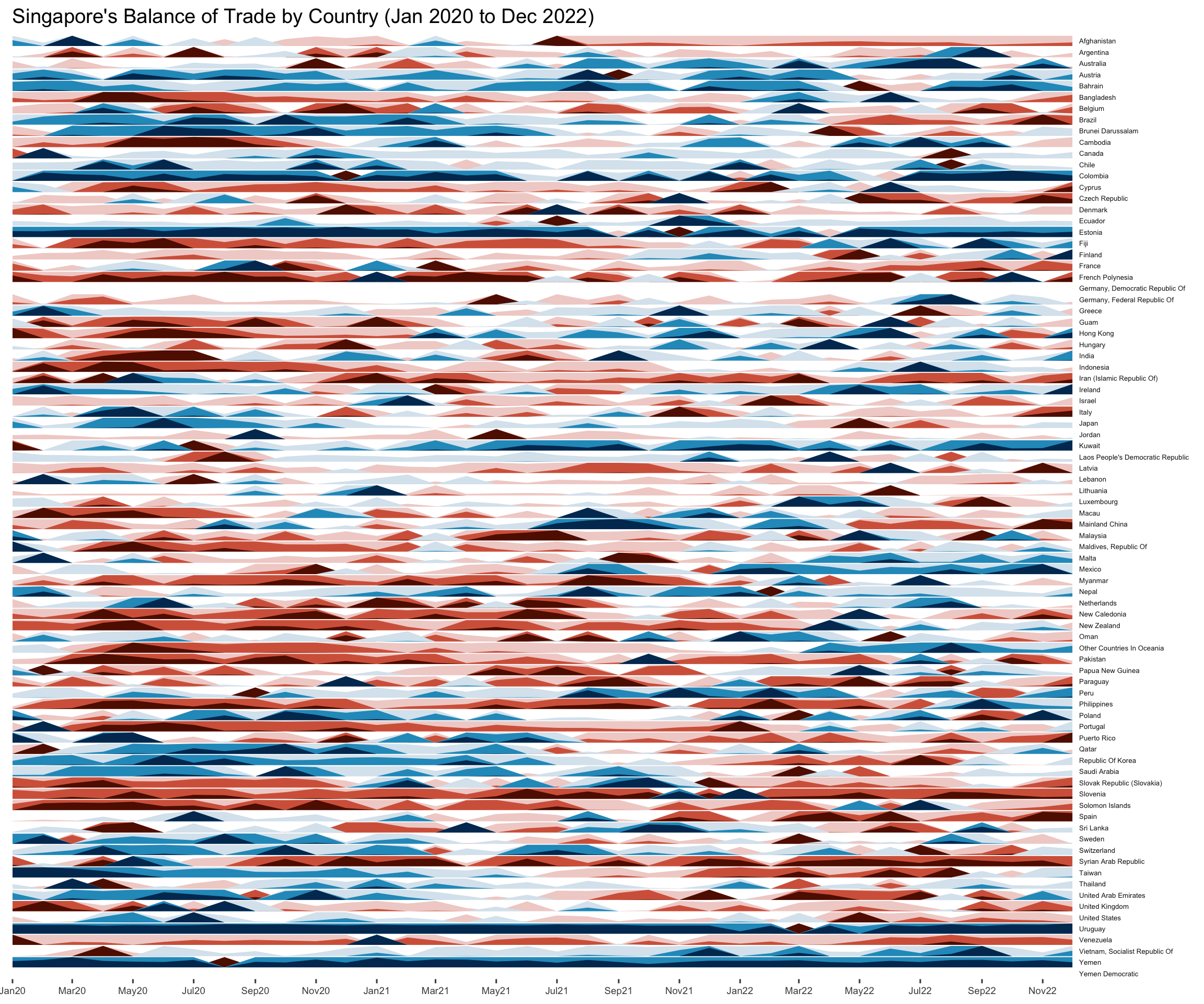
An animated bubble plot is created to show the relationship between the import and export by country. The size of the bubble presents the trade volume of different countries, and by using transition_time( ), the time change is also shown in the graph. From the animated plot, we can see that Singapore’s major trade partners include 6-7 countries, with one of them importing a large amount from Singapore in the targeted period. With the trade gradually recovering from the COVID-19 pandemic, the total trade volume increases every year.
bubble_data <- balance_data %>%
  group_by(Region) %>%
  filter(Region !="Asia" & Region != "America" & Region != "Europe" & Region != "Africa" & Region != "Oceania" & Region != "European Union") %>%
  ungroup() %>%
  na.omit() %>%
  select(Region, Year, `Import_Value(KUSD)`, `Export_Value(KUSD)`, Trade_Volume) %>%
  mutate("Import_Value(MUSD)" = `Import_Value(KUSD)`/1000) %>%
  mutate("Export_Value(MUSD)" = `Export_Value(KUSD)`/1000) %>%
  mutate("Trade_Volume" = Trade_Volume/1000) %>%
  mutate_each_(funs(factor(.)), "Region") %>%
mutate(Year = as.integer(Year))ggplot(bubble_data, aes(x = `Import_Value(MUSD)`,
y = `Export_Value(MUSD)`,
size = Trade_Volume,
colour = Region)) +
geom_point(alpha = 0.7,
show.legend = FALSE) +
scale_size(range = c(2, 12)) +
labs(title = "Singapore's Merchandise Trade Performance with Trading Partners \n Year: {frame_time}") +
transition_time(Year) +
ease_aes('linear') 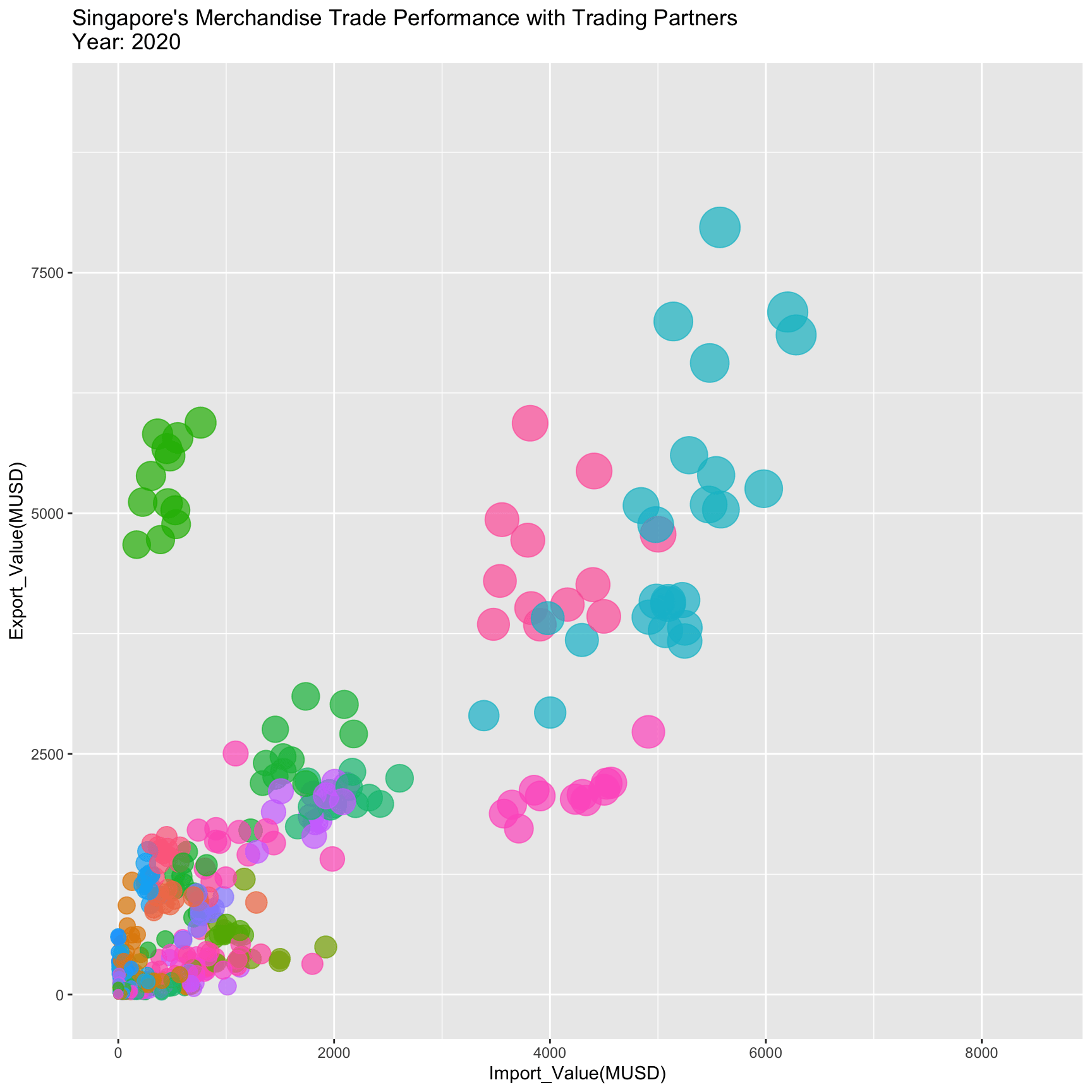
More detail can be seen in the combination of two interactive plots, where six of Singapore’s major trade partners are listed, namely mainland China, Malaysia, the USA, Hong Kong, Indonesia, and Taiwan. The plot is created by using ggplotly and the audience can compare the total year value and changes by month.
top6_volume <- balance_data %>%
  group_by(Region) %>%
  filter(Region !="Asia" & Region != "America" & Region != "Europe" & Region != "Africa" & Region != "Oceania" & Region != "European Union") %>%
  summarise("Total_Volume" = sum(`Trade_Volume`)) %>%
  ungroup() %>%
  arrange(desc(Total_Volume))
top6_volume <- top6_volume$Region[1:6]

line_top6 <- balance_data %>%
  group_by(Region) %>%
  filter(Region %in% top6_volume) %>%
  ungroup() %>%
  mutate("Import_Value(MUSD)" = `Import_Value(KUSD)`/1000) %>%
mutate("Export_Value(MUSD)" = `Export_Value(KUSD)`/1000)line_top6p <-
ggplot(line_top6, aes(x = Date)) +
geom_line(aes(y = `Export_Value(MUSD)`, color = "Export")) +
geom_line(aes(y = `Import_Value(MUSD)`, color = "Import")) +
facet_wrap(~Region, ncol = 3) +
stat_difference(aes(ymin = `Import_Value(MUSD)`, ymax = `Export_Value(MUSD)`), alpha = 0.3) +
labs(x = "Time", y = "Trade Value (MUSD)",
title = "Import and Export Value of Singapore's Top Trading Partners (2020-2022)") +
theme(axis.ticks = element_blank(),
axis.text.x = element_text(size = 5),
axis.text.y = element_text(size = 5),
plot.title = element_text(hjust = 0.5),
legend.title = element_text(size = 8),
legend.text = element_text(size = 6) )bar_top6 <- line_top6 %>%
select(Region, Year, `Export_Value(MUSD)`, `Import_Value(MUSD)`) %>%
pivot_longer(cols = `Export_Value(MUSD)`:`Import_Value(MUSD)`, names_to = "Category") %>%
group_by(Region, Year, Category) %>%
summarise("Value" = sum(`value`)) %>%
ungroup()
bar_top6p <-
ggplot(bar_top6, aes(fill=Category, y=Value, x=Year)) +
geom_bar(position="stack", stat="identity") +
facet_wrap(~Region,ncol = 6) +
labs( title = "Import and Export Value of Singapore's Top Trading Partners (2020-2022)") +
theme(axis.text.x = element_text(size = 5),
axis.text.y = element_text(size = 5))subplot(bar_top6p, line_top6p, nrows = 2)After analyzing the trade by country, the trade of continents is given in this part. Instead of using a line graph, two slopegraphs created by newggslopegraph( ) is here to compare changes in the import and export of continent by year. From the graph, we can see Singapore’s trade volume mainly comes from Asia and there is an overall growth for all continents in export and import, except for America’s export value.
imp_slopegraph <- balance_data %>%
  select(Region, Year, `Import_Value(KUSD)`) %>%
  group_by(Region, Year) %>%
  filter(Region == c("America", "Europe", "Asia", "Africa", "Oceania")) %>%
  summarise("Import" = sum(`Import_Value(KUSD)`)/1000) %>%
  ungroup()

exp_slopegraph <- balance_data %>%
  select(Region, Year, `Export_Value(KUSD)`) %>%
  group_by(Region, Year) %>%
  filter(Region == c("America", "Europe", "Asia", "Africa", "Oceania")) %>%
  summarise("Export" = sum(`Export_Value(KUSD)`)/1000) %>%
ungroup()import_slope <- imp_slopegraph %>%
mutate(Year = factor(Year, ordered = TRUE, levels = c(2020,2021,2022))) %>%
newggslopegraph(Year, Import, Region,
Title = "Import Value of 5 Continents",
SubTitle = "2020-2022",
Caption = "(million USD)")
export_slope <- exp_slopegraph %>%
mutate(Year = factor(Year, ordered = TRUE, levels = c(2020,2021,2022))) %>%
newggslopegraph(Year, Export, Region,
Title = "Export Value of 5 Continents",
SubTitle = "2020-2022",
Caption = "(million USD)")
grid.arrange(import_slope, export_slope, ncol = 2)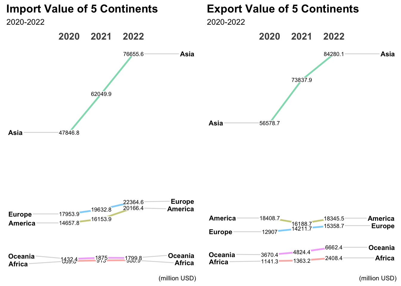
The animated line graph is plotted by transition_reveal( ) to show the changes in Singapore’s trade balance of five continents. The reference line is set as zero and we can see that Europe’s import to Singapore accounts for a larger part and Africa’s import and export are also equal in 2020 and 2021. By comparing the slopegraph and animated graph, the situation becomes clearer.
bot_line <- balance_data %>%
  select(Region, Date, BOT) %>%
  group_by(Region) %>%
  filter(Region == c("America", "Europe", "Asia", "Africa", "Oceania")) %>%
  mutate("BOT" = `BOT`/1000) %>%
ungroup()bot_line %>%
ggplot( aes(x=Date, y=BOT, group=Region, color=Region)) +
geom_line() +
geom_point() +
geom_hline(yintercept=0, color="orange", size=.5) +
scale_color_viridis(discrete = TRUE) +
ggtitle("Singapore's Balance of Trade from 5 Continents") +
theme_ipsum() +
ylab("Balance of Trade (Million USD)") +
transition_reveal(Date)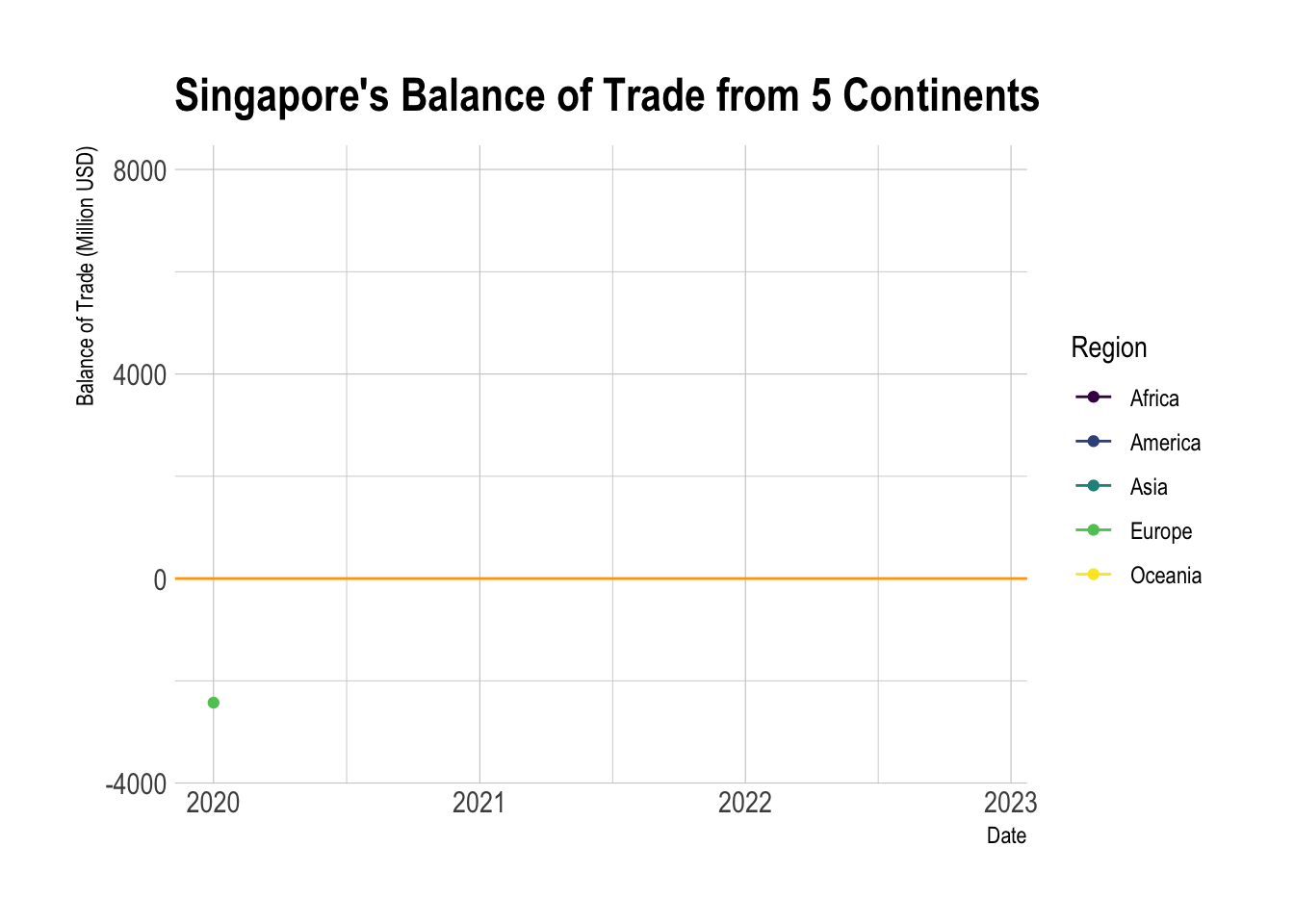
The line graph compares the same period of the previous year to see how the trade from mainland China changed. The red reference line is to show the average trade balance value and the zero value. From the line graph, we can see that there is a similar trend in different quarters.
cycle_data <- balance_data %>%
  select(Region, Month, Year, BOT) %>%
  group_by(Region) %>%
  filter(Region == "Mainland China") %>%
  mutate("Mainland_China" = `BOT`/1000) %>%
  ungroup() %>%
  select(Mainland_China, Month, Year)

hline.data <- cycle_data %>%
  group_by(Month) %>%
summarise(avgvalue = mean(`Mainland_China`))ch_import <- cycle_data %>%
ggplot() +
geom_line(aes(x=Year,
y=Mainland_China,
group=Month),
colour="black") +
facet_wrap(~Month, ncol = 6) +
geom_hline(yintercept=0, color="grey", size=.5) +
geom_hline(aes(yintercept=avgvalue),
data=hline.data,
linetype=6,
colour="red",
size=0.5) +
labs(axis.text.x = element_blank(),
title = "Singapore Balance of Trade of China, Jan 2020-Dec 2022") +
xlab("") +
ylab("Balance of Trade (Million USD)") +
theme(axis.text.x = element_text(size = 3),
axis.text.y = element_text(size = 5))
ggplotly(ch_import)In this take-home exercise, interactive and static graphs are created to visualize time. My key takeaways are:
The ggplot package provides a wide range of plots to visualize data, but before plotting, the data frame is required to be arranged. In this exercise, the data is wrangled many times to fit in, and I need to improve my skills in handling data more efficiently to avoid repeating work and make the code tidy.
The animation in R packages is a powerful tool to display changes in time. The graph can be more straightforward for the audience to present the trend and facilitate future analysis. The fancy design, however, sometimes may become confused and the author needs to adopt it properly.