pacman::p_load(ggiraph, plotly, gganimate, DT, patchwork, gganimate, gifski, gapminder, readxl, tidyverse)In-class Exercise
Installing and loading R packages
Two packages will be installed and loaded. They are: tidyverse and ggiraph
importing data
exam_data <- read_csv("data/Exam_data.csv")p <- ggplot(data=exam_data,
aes(x = MATHS)) +
geom_dotplot_interactive(
aes(tooltip = ID),
stackgroups = TRUE,
binwidth = 1,
method = "histodot")
girafe(
ggobj = p,
width_svg = 6,
height_svg = 6*0.618
)p <- ggplot(data=exam_data,
aes(x = MATHS)) +
geom_dotplot_interactive(
aes(tooltip = CLASS,
data_id = CLASS),
stackgroups = TRUE,
binwidth = 1,
method = "histodot") + scale_y_continuous(NULL,
breaks = NULL)
girafe(
ggobj = p,
width_svg = 6,
height_svg = 6*0.618, options = list(
opts_hover(css = "fill: #202020;"),
opts_hover_inv(css = "opacity:0.2;")
) ) exam_data$onclick <- sprintf("window.open(\"%s%s\")",
"https://www.moe.gov.sg/schoolfinder?journey=Primary%20school",
as.character(exam_data$ID))
p <- ggplot(data=exam_data,
aes(x = MATHS)) +
geom_dotplot_interactive(
aes(onclick = onclick),
stackgroups = TRUE,
binwidth = 1,
method = "histodot") +
scale_y_continuous(NULL,
breaks = NULL)
girafe(
ggobj = p,
width_svg = 6,
height_svg = 6*0.618) plot_ly(data = exam_data,
x = ~ENGLISH,
y = ~MATHS,
text = ~paste("Student ID:", ID,
"<br>Class:", CLASS),
color = ~RACE,
colors = "Set1") %>%
layout(title = 'English Score versus Maths Score ',
xaxis = list(range = c(0, 100)),
yaxis = list(range = c(0, 100)))d <- highlight_key(exam_data)
p1 <- ggplot(data=d,
aes(x = MATHS,
y = ENGLISH)) +
geom_point(size=1) +
coord_cartesian(xlim=c(0,100),
ylim=c(0,100))
p2 <- ggplot(data=d,
aes(x = MATHS,
y = SCIENCE)) +
geom_point(size=1) +
coord_cartesian(xlim=c(0,100),
ylim=c(0,100))
subplot(ggplotly(p1),
ggplotly(p2))DT::datatable(exam_data, class= "compact")d <- highlight_key(exam_data)
p <- ggplot(d,
aes(ENGLISH,
MATHS)) +
geom_point(size=1) +
coord_cartesian(xlim=c(0,100),
ylim=c(0,100))
gg <- highlight(ggplotly(p),
"plotly_selected")
crosstalk::bscols(gg,
DT::datatable(d),
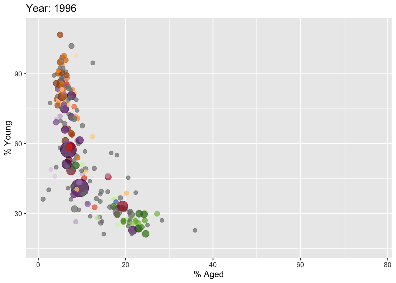
widths = 5) col <- c("Country", "Continent")
globalPop <- read_xls("data/GlobalPopulation.xls",
sheet="Data") %>%
mutate_each_(funs(factor(.)), col) %>%
mutate(Year = as.integer(Year))ggplot(globalPop, aes(x = Old, y = Young,
size = Population,
colour = Country)) +
geom_point(alpha = 0.7,
show.legend = FALSE) +
scale_colour_manual(values = country_colors) +
scale_size(range = c(2, 12)) +
labs(title = 'Year: {frame_time}',
x = '% Aged',
y = '% Young') +
transition_time(Year) + #<<
ease_aes('linear') #<<